Our interaction with many brands is almost exclusively screen-based now – through a website, phone app or other screen interfaces, such as cash machines or self-service supermarket checkouts. Yet an often overlooked part of the branding and brand design is how compelling your visual identity looks onscreen and how easy it is to interact with and ultimately buy. This vital fusion of aesthetics and functionality in your user interface makes up the user experience.
Everything has to be faster, easier and more attention-grabbing, especially with mobile users facing multiple distractions.
Because of this, it is now common for brands to review their visual identity, fully aware that what works well in print may fail onscreen. Traditional print media brands USA Today and Harvard University Press have over the last year tailored their identities to the online environment. HUP’s recently announced move is the most radical. Swapping its shield-encased Latin and leaves for the more manageable yet abstract letter H, the new logo is perfect for apps, digital reading devices, web browsers and, oh, book spines.
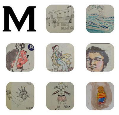
Similarly, stationery specialist Moleskine’s rebrand is geared for online use. An ‘M’ forms one corner of a square made up of nine modules. The remaining eight are used as flexible windows that can show social media tabs or showcase online photo galleries and video displays. The monogram has debuted online, but will only affect physical communications and packaging from next year.

So much of the brand-consumer relationship is now onscreen, even in traditional face-to-face environments. At New York’s JFK Airport recently, I noticed that the food outlets featured touchscreen terminals on which customers made their selection. My entire interaction with this brand – until the food was handed over by a human being – hinged on the onscreen user interface, how it presented its offerings and how easy it was to order.
Later, in an airport bar, a screen – not a person – took our orders. We selected Budweisers, which duly arrived by the waiter. I took away two interesting observations. Firstly, the Budweiser design, intricately detailed, is more suited to the physical world rather than the on-screen thumbnail. I would have struggled to work out what I was ordering from the on-screen image if I didn’t already know Budweiser (therein lies the power of a long-established brand!).
Secondly, how would a newly established, more local or less recognisable brand have fared in the same environment? Even FMCGs that aren’t obviously digital products are going to have to shape up for digital to sell via third parties. Just think about your online food shopping process – you are making a purchase decision, to a certain extent, based on a thumbnail image.
With this in mind, it is interesting to see that online grocer Ocado last year redesigned its own-label packaging, enlarging its trademark swirl in a range of bright colours and using clear upper-case type to unify all its products and achieve onscreen recognisability on its website or phone app.

Brands need to re-think everything we thought we knew about interacting with consumers because that interaction – that user interface – has changed dramatically. User experience and user interface are as important now as brand messaging and visual look and feel. I would almost go as far as to say they are now more important, although of course, brand identity feeds into the digital experience, so the two are inherently intertwined.
Take banking as an example. Personally, I interact more often with my bank, NatWest, through its iPhone app and various personal and business web-applications than through its physical or paper-based touchpoints. When the bank released a very on-brand version of its iPhone app with a massively improved UI/UX, my estimation of NatWest went up by more than it would have done through pretty much any other brand or marketing-related activity it could have undertaken. UX is a keystone.
My advice to brands is that keeping things simple goes a long way. Evaluate your UI/UX against what your competition is doing. Review the channels through which your customers interact with your brand and ask yourself if there are other digital applications or services you should offer to make the buying process easier.
And if you are a branding agency, you need to hire or train great UX people – fast – or get sidelined!
However, this doesn’t mean that strong visual branding and differentiated messaging isn’t important. It absolutely is, but the challenge of doing this is now so much greater because of the dynamic and limiting nature of digital design, as well as people’s increased level of distraction.
For more information about Brandworkz, digital asset management or brand management software please get in touch.


