Many of you will have heard that Carphone Warehouse is merging with Dixons, Currys and PC World to become Dixons Carphone. I’m probably not alone in thinking they’ve come up with a terrible name – not least because the associations that spring to mind are somewhat dubious.
One could of course argue that it really doesn’t matter much what the new company calls itself because for most of its latter – and very successful – life, ‘Carphone Warehouse’ had nothing to do with phones installed in cars, and furthermore customers below a certain age wouldn’t have a clue what a carphone was.
To a large degree, brand names with the wrong inherent meaning, like ‘Carphone Warehouse’, can still work well if they have been imbued with meaning through brand-building, marketing and longevity of use.
I understand that the people who came up with the Dixons Carphone name want to retain the substantial equity in the existing brand names, but surely this merger of Carphone et al now offers the perfect opportunity to rename and rebrand?
The company will be spending an enormous amount of money rebranding all its stores and materials anyway, as well as big bucks on making people understand what the new combined offering is all about, so why not take the step and rename it to something which also has some inherent, relevant meaning – and doesn’t sound ridiculous?
Brand is much more recognised these days as a strategic business asset, yet it is rarely thought through at the boardroom table during merger negotiations. When two companies decide to merge, and ahead of any public announcement, decisions should be made about what the new brand will be named, how that name will be perceived, and how the name, symbol and visual identity will work together in the marketplace.
What could the naming and branding options for Dixon’s Carphone have otherwise been?

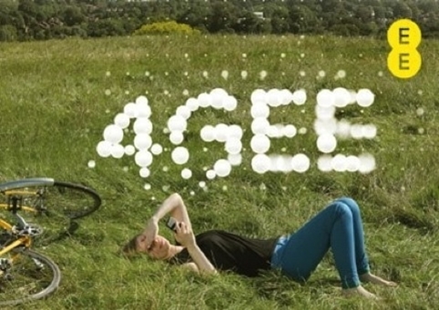
EE branding by Wolff Olins
When EE, the post-merger baby of Orange and T-Mobile, was launched it was completely new to consumers. Two hugely successful brand names, with strong equity, had been ditched.
In the ‘90s Orange had changed the face of mobile network advertising and brand-building. It managed to make a mobile network aspirational, standing for optimism and positive thinking with its slogan ‘The future’s bright. The future’s Orange’. Its distinctive advertising never showed a mobile phone, but rather, the human emotions that Orange facilitated.
The T-Mobile brand, while significantly less unique, was nonetheless a big brand name, built through aligning itself with music.
The merger of the two companies didn’t bolt together the two names; they entirely rebranded, taking on the name, Everything Everywhere, and later simplifiying it to EE (even Olaf Swantee, chief executive of EE, said he’d found the Everything Everywhere name ‘difficult’ and even ‘silly’).
EE was shorter, snappier and easier to use but, vitally, it wasn’t just a cobbled-together version of the two existing names, and the long form also had some inherent meaning. This bold decision could easily have backfired, but the business has invested heavily in giving it meaning. It has very quickly become a high-street stalwart and a recognised choice for those choosing a mobile phone network.

Penguin Random House logo
As another example, Penguin and Random House merged last year; a powerful marriage between the biggest name in British publishing and the German-owned conglomerate. Probably unwilling to adulterate Penguin’s iconic image, the newly-named Penguin Random House simply put the names and logos side by side in what it said was a ‘temporary’ design. A year later it is still there.
I’m not the only one left bemused. Ironic alternative designs and brand names have been appearing online with offerings such as Random Penguin, Penguin House and Habitat for Penguinity . (Personally, I would put the penguin on the roof of the house like a spoof King Kong if I had the time.)
You have to wonder how the merger has gone down internally. How is the lack of clarity on structure, values and identity affecting the employees? Are they effectively operating as two companies, with their own commissioning and editorial rules or with a unified strategy? And what impact will this have on the quality of output and ultimately sales?

United Airlines logo
A more successful brand fusion was the merger between United and Continental Airlines in the US. It chose to keep the United name and the Continental logo as the newly merged identity. Although it was rightly criticised at the time for being boring and corporate and for ditching United’s tulip icon, it does at least feel coherent.
Despite my instinct that Dixons Carphone has missed the opportunity to come up with a great brand name, time will tell. A report by Harvard Business Review has found that businesses which adopt a name-merge branding strategy, like Dixons Carphone’s, actually exceed the market by three per cent when stock performance is analysed three years post-merger, when compared with businesses which follow some of the branding options I’ve outlined above.
The Dixons Carphone name may well prove me wrong, but I can’t help thinking that I will be a little bemused every time I pass one of their stores in the future.
Click here to find out more about Brandworkz brand management software


