Any brand manager will be only too well aware of the pressures that go with a new rebranding strategy.
But the recent run of high-profile rebranding launches that have backfired badly, including Everton FC (as reported in Design Week recently), has pointed up even more sharply the need for caution and prudence in rebranding strategy and implementation.
Here are four examples of recent rebranding strategy implementations that make the point, not from a subjective design perspective, but in terms of consultation, brand-customer interaction and implementation.
Four cautionary tales
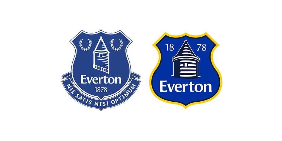
Everton Football Club is among the oldest in Britain, founded in 1878. In May this year, the club released designs for what it described as a ‘more modern, cleaner and dynamic’ new logo.
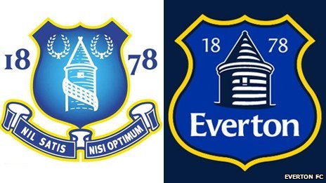
The response from fans was hysterical derision, with a 20,000-signature petition demanding the return to the wreaths, motto and badge of the old logo.
The club went into instant reverse, albeit temporarily, and decided to keep the original crest for the current season.
However, Everton FC still insists that it remains ‘firm in the belief that our crest should be modernised’.
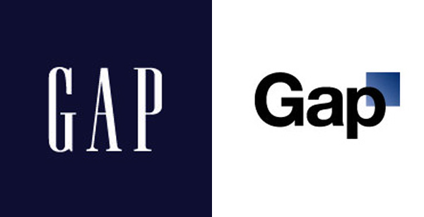
Fashion giant Gap was rendered speechless by the kicking it received from customers when it launched a new logo in 2010. The company took several days to recover from its surprise at the tide of condemnation.
Then it invited the public to submit ideas for a new logo. But within a week, the company had canned the crowdsourcing project and pulled the new logo.
The University of California had a similar experience with the launch of an expensive new logo in 2012. Alumni and students instantly rebelled, saying the new design was ugly and incomprehensible.
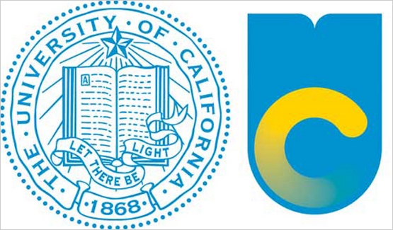
A few days later the university announced it was suspending the new logo.
Remember the fuss when, in 2007, the London Organising Committee of the Olympic Games launched its logo for the 2012 Games?
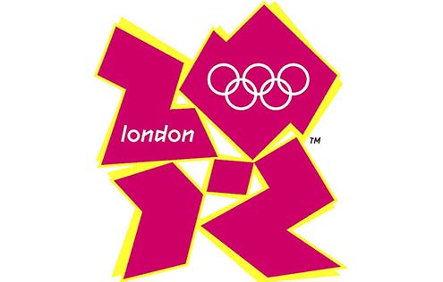
A petition calling for the logo to be scrapped gathered 60,000 signatures, while media contempt heaped opprobrium on LOCOG chiefs. But there was no capitulation. The committee went right ahead and built the games around the brand it had created.
So what are the insights to be gathered from these vignettes?
In the case of both Gap and the University of California, the mistake was in releasing ‘just a logo’. Rather than building a refreshed, contemporary meaning into a new brand strategy rooted in research and strategic thinking, they merely gave the logo a paint job.
It appears that neither organisation communicated what its rebranding strategy was, why it was rebranding or what the new brand stood for.
Only by understanding where your organisation should be heading, understanding your customers and developing a brand identity that speaks to both internal employees and external customers can the brand manager be confident that the creative route chosen is the right one.
There will always be some post-launch criticism of course but determination founded on thorough preparation will go a long way towards eliminating the potential embarrassment of a limp U-turn.
And Everton Football Club? Well, it may still win in extra time. The club has recently announced that pressing onward with modernising the Everton brand, its new crest is to be designed by Liverpool-based group Kenyon Fraser – in consultation with the fans.
Though the club had quite properly consulted fans and shareholders during the first attempt at rebranding, it lost its nerve when the response to the proposed new logo turned out to be negative.
As a result, that initial exercise will still have been extremely costly. With the old logo temporarily remaining in place, sales of branded merchandise will plummet because the branding will be out-of-date next year, while the club is faced with the cost of starting the rebranding process all over again.
It remains only for the 2012 London Olympics experience to make the key point and bring us to the moral of the story.
Stick to your guns!
When LOCOG unveiled the London Olympics logo and the surrounding visual elements, it was merely a design on a sheet of paper, an overarching concept for an event that was still five years away.
It wasn’t easy to envisage how the controversial logo would be applied in the context of stadia, media promotion, the wider event environment or in central London itself.
Personally, I’m still ambivalent about the logo itself as I’m sure many others will be, but by holding firm to the chosen design, and an amazingly consistent and prominent application of the whole visual system, which did look great and added real personality, LOCOG and its implementation partners came through with a stunning result in branding terms.
And here’s the crunch: by the time the Games came round, virtually nobody was complaining about the logo. Indeed, it had come to embody all that was good about the London Olympics.
Bottom lines
- Underpin with research, strategic thinking, consumer insight.
- Consult clients, staff, customers, suppliers and all who have a vested interest. That doesn’t mean you have to go for lowest common denominator – if you truly believe something radical is right, then go for it.
- People don’t like change; so first make sure you know why you are making any change, and then do everything you can to ensure your stakeholders understand it as well!
- Have the belief and courage to see the project through. If you are doing something radical, or you have very emotionally invested clients/fans, then there will be a backlash on launch so have material and PR strategy prepared for it.
- Finally, the creation of the brand identity and initial unveiling is only half the battle. You also have to win the equally challenging battle of getting it implemented successfully on all touchpoints – the topic of one of my earlier posts here.
Find out more about Brandworkz Brand Management Software and digital asset management
